Skip navigation

Monthly Archives: June 2014

During one of the long weekends in May 2014, I (Chris) visited Cologne (Köln), Germany.

dom-1

Cologne, situated on the Rhine in the North-Rhine Westphalia region, the 2000 year old city is world famous for its cathedral – it is the largest church in Germany. The main train station (Hauptbanhof) is located right next to it – architecturally setting up a clash of the modern against the medieval.

dom-20

Construction started in 1248 and this gothic masterpiece was completed 600 years later, in 1880, according to its original plan. The Sagrada Familia basilica of Barcelona only took 130 years so far and is still a work-in-progress – see our blog post here about that famous church.

dom-2

.

dom-3

There are volumes written about this church so I would not say much here … the cathedral also has an excellent web site providing virtual tours, click here.

dom-4

The “swallow’s nest” organ, installed in 1998, was suspended from the ceiling above the nave by steel wires.

dom-8

Aisles on either side

dom-5

.

dom-6

Gerhard Richter designed these windows according to the colors of the older stained glass.

dom-9

.

dom-7

Shrine of the Magi (three kings) – the relics were brought to Cologne from Milan in 1164. From about 1190 to 1220 a number of artisans worked on the shrine in the workshop of the goldsmith Nicholas of Verdun and in workshops in Cologne. The photo below does not do justice to the artistic and religious significance of the piece.

dom-10

Altar-piece of the city’s patron saints in the Lady Chapel, painted around 1441. Mass is said in the Lady Chapel every day, this altar-piece is in daily liturgical use.

dom-11

Transept and crossing

dom-12

.

dom-14


According to the website, “the cycle of angels depicted in the spandrels of the arcades in the high choir was executed by the Late Nazarene painter Edward von Steinle between 1843 and 1845 using a fresco technique on a gold background. “, replacing 14th century fresco that was deemed too damaged to be restored.


dom-13


One can climb stairs to reach the roof where I can imagine great views of the city and the Rhine. But the long line of people waiting to go and the number of steps deterred me.

A true masterpiece landmark.

How does it compared with the Duomo in Milano ? See our blog post here on the Duomo.


This is my last post on the Salone. I am sure many of you had seen enough of my furniture pictures on this blog. Just in case you want to start from the beginning, click here.

salone hilights -19

Before I put up pictures of my trip in Kòln, Germany, here are some more stuff that I saw in Milano.

salone hilights -13

This room caught my eye especially the chandeliers.

salone hilights -10

Designer pieces.

salone hilights -9

Molteni & C

salone hilights -11

Zaha Hadid’s home at the “Where Architects Live” (Dove vivono gli architetti) exhibition

salone hilights -15

Roche Bobois

salone hilights -17

Clever wallpaper (including fake fireplace)

salone hilights -21

Graphic wallpaper

salone hilights -18

Minimal kitchen – so much so that it looks like the bedroom.

salone hilights -20

Furniture for a nightclub

salone hilights -12

“Kitchen, Soul, Design” (L’Italia che Vive)  360 degree view + surround sound media

salone hilights -14


It was an eye-opening, feet-killing, exhaustive day but it was worth it. Ciao.

This is the penultimate blog post on the Salone. The exhibition halls at the Salone that show furniture were divided into 3 sections: design, moderno and classico. The classico section occupied Hall 1 to 4.

classic salone-3

The distinction between the designer and moderno sections were less clear cut, although the latter only occupied Hall 14 and 18. But the classic section was very clearly different.

classic salone-8

One big difference was the lack of crowds. The aisles were quiet that one really feels like being inside a giant warehouse.

classic salone-9

The exhibitors have names that I have never heard of. I guess many of them create custom pieces for private clients and not the mass market.

classic salone-2

These exhibitors do not show their products to the passing public as they hide everything behind paneled walls. Viewable by invitation only ?!

classic salone-7

Looked like the exhibitors in the classic section cater mostly to the oligarchs, sheiks, princelings, and  techbillionaires.

classic salone-6

These exhibitors definitely did not like visitors to take photos. This saleswoman wearing a ball gown was staring to discourage me from photographing their white fake goddess columns.

classic salone-5

It is a whole different world of tastes in Hall 1 to 4 !

classic salone-1

Film and TV titles design is an art form. However, many such works have been overlooked, ignored, or forgotten. Unlike a trailer which contains actual footages, film title is often created separately from the film itself. Title art grew in 1940’s out of Hollywood studios’ desire to present a more complete list of credits and using better quality artwork to distinguish their productions from others.

Here is a brief history of film title.


Title design has to inform (who worked on what), entertain (otherwise no one will pay it any attention), and impress (set the tone if it precedes the main).


The Girl with the Dragon Tattoo


The James Bond franchise defined a very distinct and iconic  style for presenting its credits.

Casino Royale


These are two of my favorite anime TV series, both by Shinichirô Watanabe (渡辺 信一郎), and each accompanied by a great soundtrack and title sequence.

Samurai Champloo


Cowboy bebop


I (Chris) seldom watch a film more than once, unless it is so good or so opaque that it warrants a second viewing. But for film titles, I can watch it several times in a row and then come back and watch it again several months later.

Stranger than Fiction – End sequence


Here is another remarkable film about type – no CG was used in this film !


I am a fan of the web site – The Art of the Title – which does a really good job of presenting interesting new as well as old title designs. Check it out!

Continuing with my posts on the stuff I saw at the Salone Internazionale del Mobile in Milan … here is a mix bag of brands – avant garde (driade), then mainstream modern housewares (Alessi) and plastic furniture (Kartell) …

Screen Shot 2014-05-05 at 11.04.47 PM

driade, founded in Italy in 1968, like to define itself as an aesthetics laboratory. See their web site here (also where I took the above screenshot).

driade-flou-1


On driade’s website, about its history, it says:

… the multiplicity of languages that make it difficult to identify trends or relationships. A variety of authors, not always easily assessable and not all entirely acceptable, is building this century, which is characterized, in art and design, by pluralism, multiplicity of signs, and “idiolects” – as Roland Barthes called the use of language specific of a single author. 

Compared to some of the modern classics I saw (Vitra, Cassina – see earlier posts here and here), this statement about Driade’s pieces does make some sense.

driade-flou-3

The last time I was in Milano, I went to their showroom and wrote a blog post – here.

driade-flou-2

Norma by Borek Sipek.

driade-flou-4

Apollonia (the lights) also by Borek Sipek.

driade-flou-5

Alessi – needs no introduction.

alessi-7

They have a store on the main raised pedestrian walkway.

alessi-2

As well as a store selling pots and pans inside one of the exhibition halls.

alessi-1

They were probably one of the very few companies that were not just showing but were actually selling something.

alessi-3

I had no idea that Alessi makes so many different models of watches.

alessi-4

Since I posted about Kartell in Paris (click here), here are a couple of photos of their exhibition space surrounded by bright yellow gold curved walls.

alessi-5

I did not like their space, too cluttered and it barely showed off their products. I honestly do not remember what I saw, especially after I have already been exposed to hundreds of chairs …

alessi-6

!


Continuing with my posts on the stuff I saw at the Salone Internazionale del Mobile in Milan … earlier posts on Poliform, Vitra and Knoll are here, here and here.

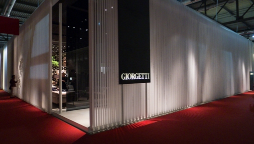
I know nothing about this company until the exhibition. And I liked some of their pieces.

giorgetti-1

Wood is their strong suit. A high level of craftsmanship exercised in the design and manufacture is visible.

giorgetti-9

The pieces are not exactly modern with all straight lines and right angles. Yet there is something modern about their designs.

giorgetti-12

The shapes are organic and relies on carpentry to achieve the desired look.

giorgetti-2

Some minimal decorations are included.

giorgetti-8


According to their web site here,

Beauty is a stratification of elements that dialogue with one another, but it is also a constant quest for contents and values.

giorgetti-3

All the pieces projected a non-industrial, warm ambiance. I think their pieces work best in a domestic setting.

giorgetti-10 

Some pieces on display are for the office, however and I definitely can see them in the lobby / reception area of a law office.

giorgetti-7

Some of the interiors use Asian accessories and accents. Their web site even has an option for Chinese (the others are English and Italian). So they must be attracting quite a bit of business from that country.

giorgetti-6.

giorgetti-11

 !


Hong Kong participated in the Salone d’Onore at La Triennale di Milano. The exhibition is called Constant Change – a theme that is very Hong Kong-esque given its historical and demographics background.


HK-1


I was genuinely, pleasantly surprised. The red lamp shades were used in the street market by butchers to make the meat looks redder and fresher. Have not seen them for years  – I really did not expect to see them in a museum in Italy.


HK-7


The exhibition has a decent web site, go here and explore. Try the app too.


HK-6


The curator said this about the show:

Hong Kong is a disjointed city. The parts of the city are not coherent, … Hong Kong appears disjointed but when you look at it street by street, it is actually harmonious in its own way. It is just totally different from any city in Europe. Hong Kong is always changing and it changes so fast. That’s why you get inspired. It looks to the future rather than the past, …


HK-5
… When you walk the streets of Hong Kong, you can see what happened twenty years ago and what may happen in the next twenty years. It appears a very modern city, but at same time it’s full of contradictions: it’s crafty and digital, traditional and breaking tradition – all at the same time.

HK-2 

The center piece is an immersive multimedia show playback-ed on six giant screens.


HK-14


Six synchronized sequences of images ran concurrently in a loop, accompanied by a soundtrack whose propulsive, almost droning rhythm and melody really matched the images and held the piece together. I do not know who made the soundtrack. It was good. I am a Philip Glass fan and generally liked this style of music. I was really glad that the soundtrack sounded new and fresh.


HK-3


From time to time, a QR code appears and the viewers are encouraged to scan it with a smartphone which opens an app and provides more content and interactions. I did not try it but it sounded like a good idea (very 21st century !).


HK-4


They served visitors instant coffee in little cups. They had a reason for doing it but I forgot …  White letters and words on the floor reproduce those signages found on Hong Kong’s streets.


HK-10


The multimedia show is bookended by poster art by local artists and examples of work created by local design craftsman – zinc metal boxes for letters, mahjong tiles, etc.


HK-11


It says “Not, Perfect”.


HK-12


The audiovisual sequences featured the famous Star Ferry which shuttles between Hong Kong Island and the tip of the Kowloon peninsula. The ships are bi-directional – they do not have to make a U-turn after docking.


HK-9


Growing up in Hong Kong, I travelled on those ships thousands of times and remember those chairs really well. The wooden back support, hinged in the middle between the front and back legs, can be tilted to a different position. Depending on the direction of the sailing, the seated passengers can all face forward and do not have to travel backwards.


HK-8


“Change is the only constant. That is perhaps the most forthright statement – trite as it may seem – to describe Hong Kong.”
 

HK-13

During the week of the Salone Internazionale del Mobile, the Triannale di Milano held a number of special exhibitions. One of them concerns the city of Milan itself.

milan id-2

According to its web site  > here, it’s all about Milano,

The exhibition presents the historic signs and symbols of Milan, illustrating what the city has become today in the collective imagination through the evolution of its coat of arms and of the symbols of the city and its community. It also includes the faces of important native and adoptive Milanese, the city’s great artistic icons, and profiles of significant historical and modern buildings.

milano id-20


Here’s a sample of what I saw.


milan id-13

The specially commissioned graphics poster were displayed on a platform with slowly rotating easels.

milan id-4

Haha …  the furniture exhibition !

milan id-6

.

milan id-7

.

milano id-22

.

milan id-8

Last Supper.

milano id-23


La Cotoletta alla milanese (similar to Wiener Schnitzel except the italian version is cooked and served with the bone in). See our post here about what we had in Vienna.

milano id-21


I have seen some of these painting in the Museo Novocento next to the Duomo during my last visit. See my blog posts about that museum here and here.

milan id-12

.

milan id-11

Achille Castglioni is one of the few names I recognized. He designed our flatware.

milan id-10


The exhibition poster.

milan id-1

Viva Milano.


The five hundredth post !   500th !

Can you believe it ? Frankly, I find it hard to believe that this blog has been continuing thus far.


500th-1


Except in the first few months after the launch of the blog, there are usually 10-15 photos per post. Roughly, there must be nearly 5,000 uploaded photos now. What is sustaining it ? The blog must be serving some purposes – a way to stay in touch with families and friends, a public photo album, a kind of travel diary, or a creative outlet. Well, the photos on this blog has been pinned on Pinterest many times (particularly my picture of the Duomo in Milan).


Over the Loire

500th-20


The maintenance of a personal blog is very much a 21st century hobby. According to WordPress’s statistics, the blog has managed to attract on average in the last year about 50 views per day. And I receive comments from you guys once in a while. You know who you are and thank you very much. With your comments, I know someone is reading and responding to the content, and it is not just some random hits sent by a search engine because of a key word match.


Sunrise at Mount Teton

sunrise-1


I will continue with the blog but also start thinking about changing something. Possibly a different layout theme ? Perhaps I may post less frequently but write better and pick fewer but more striking photos, possibly in a larger format. Another change could be to diversify the topics. It has become very travel-oriented because photos are easy to accumulate and we enjoy traveling. In the beginning, it was a bit food-focused (food porn was “in” at that time). There were also some music-related posts and even one or two product reviews.


Chez Ron & Betty

500-10


Unfortunately, it takes time to make these changes and I don’t have much time to spare. May be I will stick with something minor – like adding a Pin it button or a share button for FB.


 MOMA, NYC

places-1


Any way, thank you for visiting and come back again. Do leave me a comment.


Buenos Aires ? (I cannot remember)

500-11


Cheers to more adventures !