Skip navigation

Category Archives: design

This is the second post on two very different bookstores in Beijing which I(Chris) visited before the pandemic.

Page One is a bookstore chain and publisher founded in Singapore in 1983 by Mark Tan (陈家强), with locations in Singapore, Hong Kong, Taiwan, Malaysia, and Thailand, and in China (early 2010’s).

This Page One bookstore in Beijing was located in the historically commercial area of Qianmen 前門 (Zhengyangmen (正阳门) and Dashilan 大栅栏, just south of Tiananmen Square.  It is now a very touristy area filled with people, souvenir stores and chain restaurants – all housed in faked old Chinese buildings.

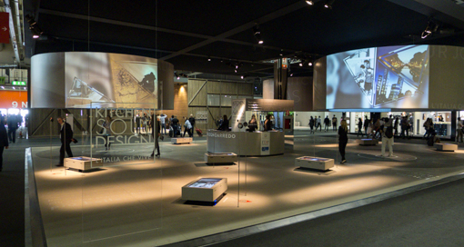
The bookstore is situated on a side street, away from the horde. The interior cannot be more different from the chaos on the street. It is a quieter, dimly-lit, cavernous space filled with books wall to wall.

Unlike typical bookstores, it did not feel claustrophobic despite the number of volumes on display.  The minimalist approach to decoration helped to maintain a calm, almost contemplative ambiance.

The overall brightness in-store was dark but the merchandises were all adequately lit and highlighted, inviting one to browse.

Like all modern bookstores, they sell toys and dolls. I guess that is one way to lure kids into a bookstore.

On each floor, several architecturally-attractive substructures were erected to create a small area separate from the main floor.

.Some of the spaces are isolating and intimate, allowing the shopper some private time with their books.

Some are display platforms while another is for enjoying a coffee.

The cafe was operated by Kyoto Ogawa Coffee, names of the origins of the beans were in English.

The upper floors resemble a more traditional bookstore with a wood-color tone on one floor, except there were books displayed in the ceiling. Interesting but not practical for consumers.

The surprise for any first-time visitor is the dramatically-framed view of the south-facing facade of Archery Tower 箭楼, one of several buildings that constitute Qiamen 前門 or Zhengyangmen 正阳门 which once guarded the southern entry into the Imperial inner City

The Archery Tower is positioned on the central north-south axis of Beijing aligned with the Mausoleum of Mao Zedong and the Monument to the People’s Heroes in Tiananmen Square, the Tiananmen Gate itself, and the imperial throne in the Hall of Supreme Harmony in the Forbidden City, the city’s Drum and Bell Towers and the entrance to the Olympic Green in the far north.

Another floor of the bookstore concentrating on the arts and literature has a plain white theme.

Photography section

Page One began as a small shop stocking handpicked art and design books in Singapore, accumulated a loyal following over the years and evolved into a brand.  We believe there are other Page One bookstores in Beijing, in Guomao – the China World Trade Center 中国国际贸易中心 and in Sanlitun 三里屯

However, the shops outside China have been closed in Singapore in 2011, Taiwan in 2015 and Hong Kong in November 2016. We can imagine the competition Page One was facing with Taiwan’s Eslite Bookstore in the same markets. See our post on Eslite Spectrum in Hong Kong

We cannot see the Taiwanese Eslite opening a bookstore in China, let alone in Beijing. Page One is safe for now but it had to subject itself to self-censorship – books that criticize the Chinese communist party were not stocked.

This post is written in 2021, we are not sure if this bookstore in Beijing is still operating after the pandemic. I am quite sure the Wangfujing Bookstore (featured in an earlier post) is still around.

If you have not read our earlier post on the other Beijing bookstore, click here.  What a contrast !

After Dessau, our next stop was Weimar, 100 or so kilometers southwest, two plus hours by DB.  The central German city is well known because of its rich cultural heritage and its importance in German history.

Johann Wolfgang von Goethe, the literary figure, lived most of his creative life here since 1775.  Together with Friedrich Schiller, the city was a hotbed of the German Enlightenment.  In the 19th century, Franz Liszt made Weimar a music centre.  The political history of 20th-century Weimar was volatile: it was the place where Germany’s first democratic constitution was signed after the First World War, giving its name to the Weimar Republic period in German politics (1918–33).  Weimar was designated as a UNESCO World Heritage site in 1996 (Bauhaus) and 1998 (Classical Weimar).

We came here because the Bauhaus School (Staatliches Bauhaus) was founded here in 1919.  Walter Gropius, a renowned architect, took over the Grand Duccal Academy of Art and the School of Applied Arts and rechristened the combined institution the Bauhaus.

The School lasted from 1919 to 1925, when it moved to Dessau, after the newly elected right-wing Thuringian council put pressure on the school by withdrawing funding and forcing its teachers to quit.

Our focus was the new Bauhaus-Museum Weimar opened in April 2019 which presents the Gropius Collection, the world’s oldest collection of original Bauhaus works.  Another new museum dedicated to Bauhaus was also opened in Dessau in 2019 to commemorate the centenary occasion (see our earlier post here).

The site for the museum in downtown Weimar was carefully chosen – Weimarhallenpark – which forms a historical area with the Neue Museum (which we visited) and the Gauforum buildings (see photo below) built in 1937 as a symbol of Nazi power and later used by the National Socialist movement.

When the Bauhaus School was forced to leave Weimar in 1925, museum director Wilhelm Koehler chose 168 pieces and started an archive authorized by Walter Gropius.  Hidden inside unopened crates in the City Castle, the collection survived the Nazi years and was inventoried in 1950’s.

The museum exhibition on three floors focuses on the design icons who taught and worked at the School, and their works.

With a multidisciplinary focus, the museum features works of fine art, design and architecture.

Gropius argued that a new period of history had begun with the end of the First World War.  In 1923, Gropius had proclaimed the guiding principle for those working at the Bauhaus: “Art and Technology –  a new unity !”

Bauhaus cradle following the “color of shapes” idea of Kandinsky.

Instead of the traditional painting or drawing classes, the students were all expected to learn a craft and were designated as apprentices and journeyman. The instructors were “Masters”. The artists or “masters of form” taught color theory and design, and led workshops together with “masters of crafts”.

Swiss painter Johannes Itten, German-American painter Lyonel Feininger, and German sculptor Gerhard Marcks, along with Gropius, comprised the faculty of the Bauhaus in 1919.

The famed 1923 door handles by Gropius

He wanted to create a new architectural style to reflect this new era. His style in architecture and consumer goods was to be functional, cheap and consistent with mass production.

To these ends, Gropius wanted to reunite art and craft to arrive at high-end functional products with artistic merit.

Feininger’s wood cut

By the following year the School’s ranks had grown to include German painter, sculptor, and designer Oskar Schlemmer who headed the theatre workshop, and Swiss painter Paul Klee, joined in 1922 by Russian painter Wassily Kandinsky.

In 1922, the School also saw the move of Dutch painter Theo van Doesburg to Weimar to promote De Stijl (“The Style”), and a visit to the Bauhaus by Russian Constructivist artist and architect El Lissitzky.

The school existed in three German cities—Weimar, from 1919 to 1925; Dessau, from 1925 to 1932; and Berlin, from 1932 to 1933—under three different architect-directors: Walter Gropius from 1919 to 1928; Hannes Meyer from 1928 to 1930; and Ludwig Mies van der Rohe from 1930 until 1933.

Barcelona chair by Mies van der Rohe in 1929

A New Bauhaus school was founded in Chicago, later becoming the Institute of Design, part of the Illinois Institute of Technology. Mies van der Rohe was the dean of architecture and designed its campus.

Walter Gropius went on to accept a teaching position at the Harvard Graduate School of Design; several Bauhaus artists designed and built over 4,000 Bauhaus buildings (called the White City) in Tel Aviv, Israel, and was declared a UNESCO World Heritage Site in 2003.

The influences of Bauhaus on the idea of modernism, art and architecture, design and crafts, culture and education are deep, transformative and global.

This is the last post on our 2019 Bauhaus pilgrimage.  There were just so much to see, read and digest.  We can do this again and will learn something completely new.


… continuing from our earlier post on the original Bauhaus Masters’ Houses,

The first house we saw when coming from the School was the new Director’s House (Direktonenhaus) where the information desk is situated.  Why are there new Masters’ Houses ?

After the Bauhauslers moved out in 1932/1933, the school was closed by the Nazis, and the Houses were altered.  As the home of the Director, the Gropius building was large, had a garage and rooms for servants’ quarters, all surrounded by a tall white wall.

Dessau lost three-fifths of its buildings during World War II, being the headquarters for an important aircraft manufacturer, Junkers.  The Gropius House and the Moholy-Nagy House were destroyed on March 7, 1945, although the basement and garage remained.  The city, then in East Germany, sold the houses to Junkerswerke, a company that worked with the Bauhaus School and Marcel Breuer to develop tubular steel furniture before the war.

In 1956, the Emmer family purchased the site intending to rebuild the original house on the remaining footprint, but the planning office rejected this, and they were only allowed to build in a traditional style with a pitched roof.

The Haus Emmer had been on this site for almost 60 years with an internal layout almost exactly to Gropius’ ideal. It was only demolished in 2010 to allow for the new building to take its place.

A competition was held which was won by the Berlin architecture firm Bruno Fioretti Marquez.  The design deliberately avoided a historically accurate reconstruction.  Instead, the goal was to evoke the original design through a playful approach based on fuzzy memory – “architecture of imprecision”.

The new building was completed in 2014.  When visiting the surviving and the new houses, it has been said that the visitors will become aware of the differences between historical structures and reinterpretations while taking into account the imprecision of memories.  We think the choice of this design reflects Germany’s view of its past history.

In the cubic design of the new houses, the style of the old masters’ houses are found again, but the bare walls and ghostly translucent window express the destruction and the void left by the real houses.

The residential design of Gropius has now evolved into an open space that is used for exhibitions.

Last but not least, is the restored Trinkhalle – which was the first thing we saw as we approached the Masters’ House site.  It was originally a 1932 modification by Mies van der Rohe of the wall built by Walter Gropius around his own residence. The so-called “pump room” was a refreshment stand which broke the monotony of the austere white wall that blocked the view of a group of elegant old buildings.  The original Trinkhalle was demolished in the 60’s, and rebuilt in 2016.

Today, the Masters’ Houses are used by the Bauhaus Dessau Foundation.  We were able to visit all the houses on this site except two that were used as residences for visiting artists around the year.  To see more images of the Masters’ Houses, use this link to Google Arts and Culture’s Model Houses for the Modern Age site.


This is our third post on the Bauhaus site in Dessau. Our visit was made during the centenary year (2019) of the founding of the Bauhaus School of Design.

For this post, try a 2020 collaboration by the brothers Eno – Mixing Colours

A lot of the academic-sounding text in these Bauhaus posts were partially taken from our purchased books, pamphlets we picked up on site, as well as the copious volumes of writings on the internet, particularly https://www.bauhaus-dessau.de/en/index.html.

In 1926, in addition to the Bauhaus school building, the city of Dessau commissioned Walter Gropius to construct three pairs of identical semi-detached houses for the Bauhaus instructors (Meisterhaus, each housing 2 families) and a detached house for the director (Direktorenhaus).

These were built in a small pine wood on the street now known as the Ebertallee. The houses are about 10 minutes walk from the Bauhaus Building (our earlier post is here).

The semi-detached houses take the form of interlocking cubic structures of various heights, flat-roofed while vertical strip windows on the sides let light into the staircases.  The light-colored have generously-sized terraces and balconies and feature colorful accents on large, black-framed windows, the undersides of the balconies, and the drainpipes.  The equality of each duplex was guaranteed by simply rotating the design for the first segment and then building the second half at a ninety-degree angle.

Although they were designed in the 1920’s, they still look modern to our eyes – are they the timeless classics that the media adores ? and have we (the masses) been conditioned to recognize them as such ?

Gropius planned to build the complex based on a modular principle, using industrially prefabricated components. In view of the technical resources available at the time, apparently his plan was only partially realized.

With their white, cubic structures and complex connections between exteriors and interiors the houses showed the way forward for modern architecture and testified to the debate about standardization in housing construction.

The list of residents reads like a ‘Who’s Who’ of modernists: László Moholy-Nagy and Lyonel Feininger in one house, Georg Muche and Oskar Schlemmer in another, Wassily Kandinsky and Paul Klee in the third.  Walter Gropius occupied the Director’s House – the first house one sees when coming from the school’s direction.

For the color design of the interiors, artists such as Klee and Kandinsky developed own ideas that were closely related to their works.  Klee and Kandinsky used their white-walled homes as blank canvases for the color experiments, painting their interior spaces in almost two hundred colors, that came to light only upon restoration.  The dusty pink/purple room below was Paul Klee’s bedroom !  I (Chris) am a long-time fan of Klee’s work – in the 80’s, I bought a postcard of a painting by him with this color scheme. So this visit was particularly meaningful.

The Kandinsky/Klee Master House was reopened to visitors on 18 April 2019 after extensive restoration.  It was quite an experience for us to be able to walk through the life of Bauhaus masters in the surroundings they created for themselves. We watched all the videos running in the houses, which documented their activities.

All of the houses were fitted with built-in space-saving closets, wardrobes and cupboards, and modern (at the time) household appliances. The furnishings complied with the requirements for optimum day light exposure, ventilation, easy-to-clean surfaces and ergonomic working height.  Much of these modern simple comforts are taken for granted by us now but it must have been quite revolutionary in the 1920’s.

Gropius was interested in reforming the household. Notably, the toilet is separate from the bathroom.  The kitchen where meals are prepared is separated from the dish-washing area, and the dining room.

Others who lived here later, include Hannes Meyer (the next director after Gropius), Ludwig Mies van der Rohe (the third director), Josef Albers, Hinnerk Scheper and Alfred Arndt.

This ensemble of Masters’ houses is the epitome of the artists’ colony of the 20th century.

The Director’s House and the Moholy-Nagy/Feininger were destroyed during World War II.  See the rebuilding of these two houses on our next post.

Our second stop in Dessau is the Bauhaus school building itself.

Let some 70’s Krautrock accompany you on this post.

A lot of the academic-sounding text in these Bauhaus posts were partially taken from our purchased books, pamphlets we picked up on site, as well as the copious volumes of writings on the internet – e.g., https://www.bauhaus-dessau.de/en/index.html.  New York Times had an excellent article on the school, click here.

In 1925, the Staatliches Bauhaus moved from Weimar to Dessau and the building designed by the school’s founder Walter Gropius was inaugurated on December 4, 1926.

The sculptural composition of the Bauhaus Building comprises several volumes which Gropius planned according to their functions. Unlike traditional 19th century academy buildings, which consisted of a compact symmetric structure, the Bauhaus Building plan in the form a pinwheel conveys the impression of movement.

The Building has a skeleton of load-bearing reinforced concrete (clearly visible) and a skin of glass, which provided it with the modern signature sense of transparency, openness, and lightness.  We are looking at the mother of all boxy glass buildings of the 20th century.

By moving all supporting columns into the interiors, thus dispensing with any kind of dominating corner shape, the workshop wing is enclosed by panels of glass (Gropius was allegedly inspired by shoji screens).

Instead of installing glass panes floor by floor, the design relies on a grid system which is suspended from the roof of the building like a curtain – hence the term “curtain wall.”

Opened windows in a curtain wall – you won’t find many, if any, nowadays.

The five-storey studio building accommodated 28 students and junior masters.

The three-storey north wing rendered white is distinguished by horizontal bands of windows and was used by the vocational school.

The administration occupied the lower level and the Bauhaus’s architectural department the upper level of the two-storey bridge which connects the north wing and the Bauhaus.

Among the workshops and design studios, there was a spacious souvenir shop.

We hung around the very early-mid century cafe on the ground floor and mingled with the non-tourists.

We were able to walk through several floors of classrooms (seminarraum) and studios, and peered into empty workshops.

While it looked empty, there were names on doors and people working in offices. This Bauhaus Building is a living, working museum.

The Bauhaus and its sites in Weimar and Dessau have been included on the UNESCO World Heritage list since 1996. Not only for its architecture, the award also applies to the Bauhaus as an institution.

Its conceptual thinking aimed to shape a complete modernism in which social and societal aspects played a role, as did all facets of housing and the way of living. The Bauhaus thus represents not only a milestone in architecture and art, but also a revolutionary contribution to the history of ideas of the twentieth century.

The Building is a built manifesto of the Bauhaus idea.

Our next post is about the houses built for the school masters.


Since it was not possible to do much traveling in 2020, we do not have many photos left to share from last year.

Going back …, 2019 was the centenary year of the founding of the Bauhaus school in Germany.  We took a pilgrimage tour of the three German cities where the Bauhaus school existed: Dessau, Weimar and Berlin.  So … this is our first post about this trip in Germany.

From my (Chris) favorite German label, Kompakt:

The school was operational from 1919 to 1933 that combined crafts, architecture and the fine arts.

Our tour began in Dessau, a town 80 miles southwest of Berlin, in the state of Saxony-Anhalt, where the school was situated between 1925 and 1932. We were greeted by this installation at the Dessau bahnhof – notice the tiles behind the installation which were laid at angle, lending it more dynamism.

The first stop is the brand new Bauhaus Museum Dessau which was opened by Angela Merkel on September 8, 2019 to commemorate the centenary.  We visited it on September 29, 2019.

The museum was built by addenda architects (González Hinz Zabala) from Barcelona. Their design was selected from 831 submissions in an open international competition held in late 2015. The concept is that of a floating concrete block (“black box”) in a glass shell.  The upper floor provides optimum climatic conditions for storage and display of the collection while the ground floor is open and transparent, offering a forum for talks, dances, and performances.

There was a cafe and shop as well as a semicircular wooden “Arena” by American artist sculptor Rita Mcbride, where events can be held for a number of spectators.

The Bauhaus school became famous for its approach to design, which attempted to unify the principles of mass production with individual artistic vision and strove to combine aesthetics with everyday function.

This brand new museum will select for exhibitions from the collection of the Bauhaus Dessau Foundation, brimming with more than 49,000 items. While some of the items in the exhibition are one-off experimental works, many items are now part of everyday life.

Previously the foundation did not have such display opportunities for the vast collection.

The Wassily Chair (below), also known as the Model B3 chair, was designed by Hungarian-born designer Marcel Breuer between 1925-1926.  Also shown is one of his chrome nesting tables.

The permanent exhibition – Versuchsstätte Bauhaus – features over 1,000 exhibits and tells the story of the famous school in Dessau.

This table lamp (“MT8”) designed by German designer Wilhelm Wagenfeld and Swiss designer Carl Jakob Jucker, became known as the Bauhaus Lamp, embodying the principle that “form follows function”.

The exhibition aims to show Bauhaus as a vibrant place where people taught and learned, conducted artistic experiments and worked on industrial prototypes.

According to their website (click here), the exhibition does not “focus on the famed design icons and the masters, but rather the school and the students: the reality of learning and teaching between the poles of creative design and industrial prototype production, artistic experiment and economic pressure, educational institution and emancipatory aspiration.”

On display were snapshots and movies about the students’ daily lives, at work and at play.

There is a massive wall of names, photos, pins and interconnecting strings which graphically display the gatherings, networks, and influences of artists, craftsmen and architects of the 20th century.

The connections illustrate the historical conditions, visions, working procedures, methods, movers and shakers of the time.

New York artist Lucy Raven won the invitation competition “Kunst am Bau” with her concept of “Lichtspielhaus” – a dynamic lighting installation made of glass in different colors, which interacts with the architecture of the building.

The back of the museum faces a park. The previous building was destroyed in World War II. Dessau was heavily bombed on 7 March 1945, six weeks before American troops occupied the town.
“Bauhaus” graphic in a pedestrian subway near the bahnhof.
Next stop – the school in Dessau.

We had a guide/driver for a day in Marrakech and he brought us to Musée Yves Saint Laurent, Marrakech (mYSLm).

Concurrent with the opening of Musée Yves Saint Laurent, Paris (Av. Marceau), the Foundation Pierre Bergé-Yves Saint Laurent created this museum in 2017 with the Foundation Jardin Majorelle.

A retrospective movie Yves Saint Laurent was made in 2014. Here is the soundtrack, it has a few opera favorites and nice quiet piano pieces.

The main hall of the museum (photos not allowed) shows a retrospective featuring 50 pieces representative of the essential work of YSL from 1962 to 2002 including the pea coat (1962), the Mondrian dress (1965), “le smoking” tuxedo suit (1966) and the safari jacket (1967).

He designed clothes for women that borrowed from a masculine wardrobe, “avoiding the fashion of the moment and give them more self-confidence”.  Catherine Deneuve and Isabelle Adjani wore his designs in various movies.

The museum also has a space for temporary exhibition, an auditorium where we saw a short documentary film, a cafe and a bookshop.

YSL was trained at the House of Dior and in 1957, he found himself, at age 21, the head designer after Christian Dior died of a heart attack in his fifties.

In 1961, he opened YSL couture house with Pierre Bergé in Paris.

Les Quatre Saison (The Four Seasons) posters by YSL in 1983.

In 1970, YSL designed the first in a series of greeting cards with the word “Love” in poster form that he would send his friends, collaborators, and clients annually until 2007.

The YSL museum is adjacent to the Jardin Majorelle which was saved from demolition by Pierre Bergé and YSL in 1980. The garden (English link here), also opened to the public, was designed by the French artist, Jacques Majorelle (1886-1962) in 1923.  Jacques Majorelle commissioned the architect, Paul Sinoir, to design a Cubist villa for the property in 1931.  I included a copyright-free photo below because it was impossible to take a picture due to overcrowding.

YSL was born in 1936 in Oran, Algeria and seemed to have a great affinity for north Africa.  He and Bergé collected over 600 traditional North African objects and a Berber Museum (Le Musée Berbère, linked here) was created in 2011, which houses their collection.

Majorelle was a celebrated Orientalist painter, and a special shade of cobalt blue was used extensively in the garden and its buildings which is named after him, bleu Majorelle –Majorelle Blue. Everywhere in the garden, the blue is contrasted with almost-neon lemony yellow and deep vermilion-orange.

The garden offers a series of walkways at different levels among the boldly-colored buildings. There is a large collection of cactus, all perfectly laid out and beautifully managed.

The garden was extremely popular and it was packed with tourists. There was even an Asian couple taking bridal pictures. I cannot imagine the crowds during peak tourist season.

YSL and Bergé were a couple but they split amicably in 1976 and remained lifelong friends and business partners.

Just before YSL died in 2008 of brain cancer, Bergé married YSL. His body was cremated and his ashes were scattered in the Jardin Majorelle. Bergé died in 2017.

This museum is the most unexpected place I visited in the Museumpark area. See earlier posts here and here about this area of Rotterdam.

This is not a destination museum for me as I (Chris) have not heard of it before.

The entrance courtyard is stunning  – boldly marked by zebra stripes producing an optical effect.

The stripes and how they curve around objects reminded me a little bit of the zen gardens of Kyoto in Japan … the patterns formed by raked sand.

Apparently, the museum closes at 5pm and the last 30 minutes is free. And I happened to arrive at 4:20pm and they told me if I waited for a few minutes, I could see the exhibits for free.

Thank you very much !

The museum’s official web site is here – it is well organized and inviting. Quite a bit of its collection are online – I think they publish a book catalog with similar content. Some of the writings below came from it. See also the video below to learn more the musuem.

A guard told me I could enter the metal cage in the courtyard. I found two soccer balls inside. Are the zebra stripes a part of the work ? It was certainly amusing and it is enigmatic. It worked as a piece of art for me.

“Parallel lines” seems to be their graphic language – it is consistently deployed in their logos, publications, etc.

Museum Boijmans Van Beuningen is one of the oldest museums in the Netherlands. In 1849 the lawyer Boijmans left his art collection to the city of Rotterdam. With the acquisition of the Van Beuningen collection in 1958 the museum got the second part of its name. This is the back of the museum as seen from Museumpark.

As the museum was about to close, I did not try the “cloakroom” service – if I am not mistaken – it seems that your coat is stored (and on display) hanging in a space hovering above the lobby. I stuffed my things in one of the small wired cages on the back wall (just visible below).

The museum houses a unique collection of paintings, sculptures, installations and everyday objects. The collection of prints and drawings is apparently one of the best in the world.

There is another courtyard, more traditional, surrounded by galleries.

The museum is built with unique, intimate spaces, some of which are connected, where pieces of the collection can be viewed together in a thematic context and at an appropriate scale.

I was surprised by how much household objects that are on display – “from medieval pitchers and glass from the Golden Age to furniture by Rietveld and contemporary Dutch design”, they have them all.

The museum proudly declares that it has been shaped by private collectors. The scope and diversity are the results of 1700 private collectors who have gifted no fewer than 50,000 objects in 170 years of the museum’s history. As a result, the collection spans centuries of human creation.

I never saw this Dali before, not even in print.

Keith Haring ?

An unexpected benefit for arriving just before closing was the freedom I enjoyed with the Yayoi Kusuma installation. There were no lines. I had it practically to myself.

‘Infinity Mirror Room – Phalli’s Field (Floor Show)’ was the first of a series of mirrored rooms that Kusama began in 1965. The work was included in Kusama’s solo exhibition ‘Mirrored Years’ at the Museum in the autumn of 2008.

The brick building that houses the original collection was completed in 1935, and a modern extension was added in the 70’s.  They have just started constructing a new building –  the Depot – right next to the museum which will store the entire collection but also allows it to be viewed by the public – a concept similar to that of the Schaulager (see our earlier post) in Basel. Apparently, only 8% of the collection is currently on view.

Construction started in 2017 and the Depot is expected to open in 2020. I am looking forward to its opening and seeing more of the collection.


We spent only two days in Glasgow – clearly not enough. But we nevertheless managed to visit the Kelvingrove Art Gallery and Museum. It has been one of Scotland’s most popular visitor attractions since it reopened in 2006 after a three-year refurbishment.

The gallery first opened in 1901. The scope of its collection is wide ranging, divided into two sections: the Life galleries represent natural history, human history and prehistory.

The Expression galleries include the fine art collections.

Since we had limited time, we focused on its small collection of artifacts by Charles Rennie Mackintosh (1868 – 1928) and a special exhibition on comics.

Mackintosh (1868 – 1928) was a Scottish architect, designer, and artist which was influential on design movements such as Art Nouveau and Secessionism.

Much more can be written about him and his works but we could not see as much as we want in the gallery … and overall around Glasgow.

The special exhibition in the lower level of the gallery required a paid ticket (unlike the rest of the museum). Frank Quitely: The Art of Comics has been running for 6 months until October 1, 2017.

It was small but a surprise find for us. The above drawing must have been commissioned for this exhibit as the building behind Superman is the Kelvingrove Art Gallery.

Frank Quitely is a local, award-winning comic book artist born Vincent Deighan (1968- ).

His critically acclaimed work includes Batman, All-Star Superman, Captain America, Daredevil, The Invisibles, New X-Men, and the Sandman.

Can you see what is written in his beard ?

He has assisted superstar writer Grant Morrison in reimagining Superman and the X-Men.

More characters that I don’t recognize.

He worked with author Mark Millar on The Authority …

… and currently he is working on an American superhero comic, Jupiter’s Legacy, which will soon be made into a movie.

“We3” – published in 2004 was a collaboration with Grant Morrison. It tells the story of 3 pets – a dog, a cat and a rabbit – trying to escape from the army which has turned them into weapon prototypes.

He also drew for the graphic novel – The Sandman: Endless Nights – by Neil Gaiman. The book is divided into seven chapters, each devoted to a member of the family of brothers and sisters who are physical manifestations of the metaphysical concepts of Dream, Death, Desire, Destruction, Delirium, Despair and Destiny.

It was published by DC Comics in 2003. Each chapter is drawn by a different artist with a different style. Frank Quietly drew the last chapter. Definitely worth looking it up.

Almost forgot this post which we wrote earlier in the year.

We visited The former Hollywood Road Police Married Quarters, now renamed PMQ 元創方 in Sheung Wan, Hong Kong earlier this year. The buildings and grounds have been turned into a landmark for the creative industries. It is truly a great place to wander and shop as well as to soak up some local history and creative culture.

The history and preservation efforts of the site are well researched and documented here officially. Much of the writings below have been taken from various Hong Kong government sources.

In 1951, the site started as the Hollywood Road Police Married Quarters — the first dormitory for Chinese rank and file police officers. The site included 140 single rooms and 28 double rooms, with a semi-open design that allowed greater interaction between the residents. The site had been vacant since 2000.

The two buildings have been refurbished and upgraded for new uses. Residential units have been converted into design studios and shops, offices for creative enterprises and lodging for visiting designers. The buildings of PMQ are of modern style, feature a simple and clean appearance with a more utility approach for the design of space and form. This style emerged in the early 1950s when there was a great increase in population, resulting in great demand in buildings which required fast and efficient construction.

In order to cope with this, the design of building aimed at meeting the minimum requirement and standard which resulted in a simple and functional design. Buildings of this style are mainly built of strictly utilitarian reinforced concrete with flat roofs with minimal decoration.

This place turns out to be the childhood homes of both Hong Kong ex-Chief Executive Leung Chun-ying and his predecessor Donald Tsang.

When the government was going to auction the land, conservationists launched a campaign, citing social historical values embedded in the buildings and the fact it was once the site of Hong Kong’s first government school offering Western-style education.

Given that nearly HK$600 million of public funds has been spent on its renovation, PMQ is seen as a major test case on how Hong Kong conserves and revitalises historic buildings.

We thought about Common Ground in Seoul (see post here) – which is also a cool place for locals and tourists to socialize and shop.  Common Ground is more commercial while PMQ is more artsy – perhaps it can afford to be so as some of the tenants are sponsored.

PMQ’s mission statement says it wants to nurture the best design entrepreneurs in town, put them on the path to commercial success and become a popular destination for tourists and locals in its own right.

On the ground and first floors, there are fancy eateries and established designers and retailers like Vivienne Tam and G.O.D. Having known designer names on the premises is vital to the sustainability of the whole project, not just because of the higher rent that they pay, but also their crowd-pulling power.

We rested our feet with a few drinks at the Tai Lung Fung which adopts a certain vintage Hong Kong eatery designs.

The style is before our time and we cannot tell if it is accurate but it looks authentic.


Highly recommended.

This is the third post on what we saw at the Vitra Campus.

The Vitra Design Museum is one of the publicly accessible building on the Campus. A major retrospective – “Alexander Girard – A Designer’s Universe” was installed when we visited. Much of what is written below came from their web site which is very informative.

vitra-campus-1

The Vitra Design Museum was founded in 1989 by the company Vitra.

girard-1

It is housed in a building by Frank Gehry (who else ?). Next to it is a gallery also by Gehry, where we saw an exhibition about the Umbrella Movement in Hong Kong (see that post here).

girard-2

The work of the Vitra Design Museum is based on its collection, which encompasses not only key objects of design history, but also the estates of several important figures (including Charles & Ray Eames, George Nelson, and Verner Panton).

girard-5

It is dedicated to the research and presentation of design, past and present, and examines design’s relationship to architecture, art and everyday culture.

girard-3

Originally envisioned as a private collector’s museum, major internationally acclaimed exhibitions were presented later, including retrospectives on Charles and Ray Eames, Frank Lloyd Wright and Luis Barragán.

girard-4

It developed its own product lines to finance its activities and an independent publishing house was established.

girard-10

Alexander Girard (1907-1993) is renowned for its fabric designs and collection of folk art.

girard-8

In 1951, he was appointed as the director of Herman Miller’s textile department.

girard-9

He recognized an impulse in folk art, based on a universal human heritage of patterns, motifs and design techniques that transcends the limits of  time and place.

girard-11

Girard donated over a 100,000 pieces of folk art to the Museum of International Folk Art in Santa Fe, New Mexico. A new wing was built at the museum—which Girard designed—to house the collection.

girard-12

Vitra is licensed to make a range of products bearing his graphic designs as well as a series of collectible wooden dolls.

girard-14

Check out the web site of the Girard Studio to see more of his works.

VitraHaus is Vitra’s flagship store on the Campus. One can see, touch, compare, test, and buy all of Vitra’s home and office furniture offerings here. We visited the Campus last year and this is the second of four posts. See the Campus overview here. Most of what is written below came from their web site which is very informative.

vitra-campus-14

Designed to display the furniture brand’s Home Collection, the five-storey building consists of stacked volumes with pitched roofs covered in charcoal stucco.

vitrahaus-11

The company commissioned Basel-based architects Herzog & de Meuron in 2006 to design the VitraHaus.

vitrahaus-13

Each gabled end is glazed and cantilevers outwards up to five metres, creating the impression of a pile of houses.

vitrahaus-12

A lift takes visitors to the fourth storey, where we started the circular tour. On that day, it was a space completed in different degrees of pink.

vitrahaus-20

Internally, spiral staircases connect the intersecting interiors.

vitrahaus-22

The furniture showrooms are seamless as one moves from one area to the next.

vitrahaus-3

The lower floor is dedicated to office furniture.

vitrahaus-23

In addition to the display area for the company’s products, there is an exhibition space for the chair collection of the Vitra Design Museum.

vitrahaus-1.

vitrahaus-4

These collectible miniatures are everywhere in this building.

vitrahaus-21

Technicolor Eames.

vitrahaus-2.

vitrahaus-10

One can order a custom-made Eames chair at the Lounge Chair Atelier. The choice of every component can be made by the customer.

vitrahaus-24

There is also the Vitra Design Museum Shop and a café with an outdoor terrace.

vitrahaus-5

.

vitrahaus-8

.

vitrahaus-9

There was so much to see and buy in this building.

vitrahaus-7

According to their website, the VitraHaus has a daytime view and a reversed night time view. During the day, one looks out onto the green landscape, but when darkness falls, the illuminated interior of the building glows from within, while its physical structure fades out. The glazed gable ends turn into display cases that shine across the Vitra Campus.

We did not stay late enough to see it.

IT and I visited the Vitra Design Museum at Weil am Rhein in April 2016. It is a beautiful, well-designed (duh), starchitect-built campus – more about this place in future posts. From 26.02 – 29.05.2016, in a free-standing gallery next to the museum,  the exhibition titled “Objection! Protest by Design” was held.

vitra HK-16

The exhibition presented a number of objects that was spawned by the pro-democracy Umbrella Movement 雨傘運動 in Hong Kong that took place between 26 September 2014 and 15 December 2014. Much of what I wrote below came from the Vitra-distributed exhibition guide.

vitra HK-1

In a reaction to proposed changes in the electoral process in Hong Kong, spontaneous student protests erupted in Hong Kong. The protesters created numerous informal and improvised physical structures, graphic images, digital art, and online networks; protesters used the umbrella that gave the movement its name to protect themselves from the police.

vitra HK-9

“Broken” by Jonathan Mak. Notice the fractured leg and an off-balance star and the tiny umbrella beneath it.

vitra HK-14

There were two large “tables” which were overlaid with a large scale birds-eye view of the streets in Hong Kong.

vitra HK-8

Protesters were highly organized in their occupation of three main heavily trafficked protest sites: Admiralty, Mong Kok and Causeway Bay.

Do click on the map below here to see in details the Admiralty site.

vitra hk admiratly-1
.

vitra HK-4

A large number of installations (barricades, means to cross the expressway median), first aid stations, study areas, press stands and camp sites appeared in the 8-lane expressway and two shopping districts to become voices and means of protests.

vitra HK-7

The appearance of these installations were recorded and mapped, and shown on these two tables.

vitra HK-5Mong Kok

vitra HK-6

A number of barricades were set up to create a safety zone in order to make a defined space for resting. They were recreated here by 3D printing.

vitra HK-15

The Lennon Wall was created by students and social workers with Post-Its on a wall of a stair leading from a street up to a pedestrian footbridge in Admiralty.

vitra HK-13

They invited people to write down their hopes and reasons for staying in Admiralty after the police tried to disperse the protestors with tear gas.

vitra HK-11

At the end of the occupation, the Wall was taken down and parts of it were preserved.

vitra HK-12

The exhibition wanted to show how design not only shapes and define products, but can also function as an agent of change in politics, communications and social innovations.

vitra HK-2

I hope the people of Hong Kong all voted and voted wisely today.

We spent almost half a day in Daikanyama 代官山, most of the time in the Tsutaya bookstore蔦屋書店. For Chris who has been photographing bookstores (for example, Livraria Cultura in Sao Paulo, Alexandra in Budapest etc.), this Tsutaya branch is a temple for worshipping.

daikanyama-1

In a perfect world, all bookshops near me would be like this. Opened in 2011 after three years of development, the whole site is created by the owner of Tsutaya Books with the concept of “A Library in the Woods”. We would love to live in the midst of it.

daikanyama-2

The company, Culture Convenience Club (CCC), founded in 1983, owns a chain of bookstores and video rental outlets. It brands itself as being a culture infrastructure company in the lifestyle navigator business providing comprehensive entertainment.

daikanyama-14

If CCC is building a real estate business on top of entertainment, it may very well be a winning business formula for the 21st century. With all this talk of creating a virtual ecosystem (think Amazon) where your customers do all their shopping and content consumption, this could be an equivalent, a real-world ecosystem where your customer lingers and even chooses to live around the site.

daikanyama-3

Most of what we have written below here is taken from the official web site of T-site at Daikanyama. The site consists of three buildings connected by a walkway which splits the buildings into six different departments.

daikanyama-10

The letter “T” is used as a motif which forms a laced façade on the white exteriors, echoing “T-site”. The exterior also forms a big “T” (see below). This design was the winning submission from among 80 firms in a competitive architectural request for proposals.

daikanyama-17

Books and magazines (Japanese and Western), current and vintage are placed together in six specialty categories: Cuisine, Travel, Cars and Motorcycles, Architecture and Design, Art, and Humanities and Literature.

daikanyama-20

Starbucks is served on the ground floor.

daikanyama-16

We headed upstairs to Anjin-  a salon accented by rare collections of books and magazine from around the world – 30,000 vintage magazines from the 1960’s-70’s.

daikanyama-4

There is a skylight in the salon bringing in natural light and a footbridge that connects to the other buildings.

daikanyama-5

A short line was formed of people waiting for a table. We were gently told by the waitperson that there is a 45-minute seating limit. They needed that time limit because the place is so comfortable and people simply do not move.

daikanyama-9

The customer is surrounded by artworks, books, old and new magazines, all for your browsing, with a cappuccino (or alcoholic drinks) and delicious cakes and snacks.

daikanyama-7

As the line of waiting customers disappeared, we were left to stay as long as we liked (at least nobody came to ask).

daikanyama-6

Past issues of Studio Voice (click here) – a Japanese music magazine Chris had browsed in the past (might still have them), definitely collectible (if we have the space).

daikanyama-8

The music department is installed with hi-end vacuum tube McIntosh amplifiers and fancy speakers (cannot imagine them being allowed to operate properly in a bookstore).

daikanyama-12

The video department is intent on offering a complete selection of everything that can be bought in Japan. For classic titles previously unavailable as DVDs, they can be burned right at the store as disks to take home. While Netflix is ubiquitous and quite comprehensive, it cannot match this place for choices.

daikanyama-11

Outside the bookstore are a selection of retail stores, including Kitamura Camera Specialty store (where we bought an iphone accessory that adds a choice of macro and telephoto lens).

daikanyama-15

The T-site offers multiple eateries and even a pet grooming service and a bicycle shop in the pedestrian zone which blend into the other specialty and fashion stores in Daikanyama.

daikanyama-13

Daikanyama is a bit more grown up than Harajuku.

daikanyama-18

According to the T-site website, “The young adults who came to us for lifestyle navigation 28 years ago are now 50-something and 60-something years old. So we decided to re-invent lifestyle navigation for these adults.”

Great concept.


This is likely our last post on our visit to Copenhagen.

Scandinavian design is very well respected, especially furniture, think Swedish Ikea – and at the high end, see our post on Illums Boligus.

designmuseum-1

Designmuseum Danmark is Denmark’s largest museum for Danish and international design and a central exhibition forum for industrial design and applied arts in Scandinavia.

designmuseum-2

The museum was founded in 1890 and since 1926, it has been housed in one of Copenhagen’s finest rococo buildings, the former King Frederik’s Hospital.

designmuseum-4

The museum garden, the Grønnegård, serves as a performance space in the summer.

designmuseum-10

According to the museum’s pamphlet, “Danish designers have always been more engaged in finding practical shapes that can enhance the utility and aesthetics of existing objects for everyday use, than in revolutionizing society with utopian ideas and theoretic artistic manifests.”

designmuseum-14

Grete Jalk (1920-2006) Sløjfestolen, the Bow Chair – 1963

designmuseum-7

Not much of a real chair but at least recognizable as one.

designmuseum-8

The library at Designmuseum Danmark is the largest in Scandinavia in the field of design and the applied arts.

designmuseum-12

In addition to books, the library acquires numerous periodicals and its use is free and open for everyone. It was a very comfortable and nice place to read.

designmuseum-13

“Users of the library include craftsmen and women, designers, students and researchers from design schools, universities and museums, pupils from technical schools, set-designers, private collectors and dealers, conservators as well as people with a general interest in the field.”

designmuseum-5

Piano by Danish design legend – Poul Henningsen

designmuseum-16

We had lunch at the museum café –  ‘Klint’.

designmuseum-11

The exhibitions are organized by periods.

designmuseum-15Danish modern and Pop

designmuseum-6

There was a special section dedicated to one of their best known designer – Arne Jacobsen.

designmuseum-22

His designs are very much in daily use all over Copenhagen.

designmuseum-23

There was a temporary exhibition about toys and games as well as clothings for children …

designmuseum-9

…, furniture for the nursery and graphics for education.
designmuseum-21

All in all, it was a very nice museum. And about the right size for roaming in one afternoon.


Continuing with our trip to Siracusa, Sicily … the apartment we rented is situated on the island of Ortigia and overlooks one of the newer and straighter main street on the island – Corso Giacomo Matteotti.ortigia apartment-15

The apartment is located on the top floor of a relatively new, mixed-use building. There is a Zara on the street level, government offices on the second floor, and several residential apartments on the higher floors.

Entrance hallway inside the apartment
ortigia apartment-1Notice the horizontal stripes, there are vertical stripes in the apartment too. The style of the decoration is bold to say the least.

ortigia apartment-2There was a bedroom opposite these chairs that were not opened to us (the place could officially sleep at least six people).

ortigia apartment-3

Kitchen – dining area

ortigia apartment-5

A bottle of local wine awaited us on the dining table. Nice touch by the owner.

ortigia apartment-6

The dining area is connected to the sitting area.

ortigia apartment-4

One wall of the sitting area is covered by a giant poster, advertising the re-presentation of the classical greek tragedy – Oresteia  (Orestiade di Eschillo; written in 458 BC) by Aeschylus  – one of the few complete plays that had survived.

ortigia apartment-8

Aeschylus is recognized as the father of greek tragedy and pioneered the concept of a “trilogy” – each play serves as a chapter in a continuous dramatic narrative.

ortigia apartment-7

The sitting area faces southwest and has a wrap-around terrace. The french doors fills the room with sunlight every day (particularly in the afternoon).

ortigia apartment-9

The terrace overlooks Corso Giacomo Matteotti and the Palazzo Greco across the street. The National Institute of Ancient Drama (L’Istituto Nazionale del Dramma Antico, INDA) which celebrates their 100th year in 2015 is situated in the palazzo (photo below). Given the poster concerning a greek tragedy faces the palazzo, someone who lived in this apartment must have something to do with INDA, we think.

ortigia apartment-16

The layout of the apartment resembles that of a loft, even though there are hallways and corridors. The walls of the corridors and rooms are not structural.

ortigia apartment-10

This psychedelic corridor leads to our bedrooms and the bathroom.

The rather dramatic crimson red and inky blue master bedroom.

ortigia apartment-11

The boring second bedroom with three long empty bookshelves. Perhaps, it was used as a study.

ortigia apartment-14

The bathroom consists of two sets of sinks and toilets at opposite ends of a space joined in the middle by a tiled shower and sunken “tub”.

ortigia apartment-13

Ethnic vs modern ends of the bathroom.

ortigia apartment-12

Sue found the apartment really relaxing, with the doors opened and sunlight streaming into the living room.

ortigia apartment-17

The manager, Alessandra, was also very hospitable and helpful with information, and we had a very nice stay.

We are caught a bit off guard when the admin page of WordPress indicated that our next post will be the six hundredth (600th) that we published. As previously said several times, we are surprised that the interest in keeping up this blog has not fizzled out over the last 5 years. True it is, that we are still living in Europe and away from our friends and families, the primary reason for starting the blog. But we also find that this blog is a convenient medium to capture and frame memories of our time in Switzerland and our travels, and it became a habit and a hobby (at least for Chris).

600th-1

The blog was launched on November 4, 2009. The first trip ever reported here was our visit of Playa de Carmen, Mexico in November 2009 (click here to see). We had not yet left the US at that time but were starting to pack our belongings and worried about the move.

600th-6

Fast forward to now, posts on our quick tour of three cities – Taormina, Siracusa (Ortigia) and Catania – on the east coast of Sicily, taken during Easter, are under preparation now. Our most recent visit to Berlin and Copenhagen earlier this month has not yet been written up. Most of the photos are still in Raw format.

600th-3

Since March 2013, we have been posting a series of photos on Facebook, one a day except Sunday and Thursday when the blog is updated. There is no theme – just something random and per se visually interesting. They are essentially pictures that did not make the blog for some reasons. We gave each a serial number, a minimally-worded title and a mention of where it was taken (to the extent we could remember the location). But we wanted to share them with the readers here too – so we started showing 5 of them in a post – somewhat irregularly. This is the first of the series – #1 – “the history of cool” –  Munich.

stamps-1

So far we have shown about 150 of them here, but on Facebook, we are at #444 – there is a backlog of almost 300 random photos! On days when we are not writing the blog, these photos could keep the blog going for a while. This is #443 – “dark 3” – Taormina.

600th-4

The readership of this blog has stabilized at around 50-70 views per day. Apart from posting a link in Facebook, Twitter and Google+ each time a post goes public, we made little attempts to drive up the statistics. We also signed up Pinterest but have not seen much changes (perhaps we are not leveraging the site properly). But other people have pinned our photos on pinterest.  So if you do not feel like writing a comment, pin a photo.

600th-8

Recently, we noticed that the page view of one of our posts in April on eating durian on the street of Petaling Jaya (click here to see) has gone through the roof (more than 120 views last week alone and maintaining the momentum). It must have caught the attention of certain netizens in Malaysia (as reflected in WordPress statistics), and got linked to an index or a popular site.

durian-7

The reigning champion of page views is still our first post on HSBC’s poster ads as seen around major airports in 2010 (click here). Its two siblings are receiving decent traffic too.

This blog has changed its theme (a WordPress term for the overall look and feel of the blog) only once which happened within the first month of its launch. So the appearance remains constant for the last few years and it is getting a bit aged. But we are hesitant to change to a more modern theme as it could affect somewhat unpredictably the old posts. More experimenting is needed (if we have more time).

600th-5

One day we might want to make a book (or several books) using these photos, like the ones we did for Yellowstone National Park and Iceland back in 2007.

We have been buying books showing photos of a city “then and now” or aerial views of an area.

600th-2

Before signing off, we want to thank our readers for their interest and support, and Susie who has been responding to our posts consistently and ranks No. 1 with the highest number of comments.

600th-9

Your feedback is important as it is the only way we know someone is reading the blog. So please comment, like, retweet, follow, clip, subscribe, pin, bookmark, repost or do some good old-fashioned word-of-mouth. In the meantime, we will continue to share words and images of our adventures.

600th-7

Cheers.

My (Chris’s) eyesight is not getting better and as a result, I have to change the prescription on my lens – it is getting thicker but not quite coke-bottle thick. I changed my glasses about six months ago.

harmonic-10

I wrote about my loyalty to the ic! berlin brand of eyeglass here – click to see the other models I wore in the last 8 or so years.

harmonic-3

I am sticking with this German, handmade-in-Berlin (handgefertigt in eigener herstellung, berlin) brand a third time around. In retrospect, the shape and curvature of my first pair were quite special; the second and now third are quite similar to each other and somewhat conventional.

harmonic-1

It was a bit of a decision since they are well known for their light-weight frames made with sheet metal, as were my two earlier purchases. Now I am trying one of their plastic model.

harmonic-9

The plastic model still uses their unique screw-less hinge that works by the springiness of the metal. Having a white middle layer seems very popular at the moment as many brands are coming out with it.

harmonic-5

The frame is made with a three-layer sandwich of acetate resins – the one closest to the face is translucent light grey-ish blue, the middle layer is white and the outermost is imitation turtle shell. It is a big, size 56 frame.

harmonic-6

The frame did not come with a nose bridge but the store ordered one from the factory specially for me.

harmonic-4

The model is named Harmonic Oscillator and there is even a little diagram etched on the inner side of the frame to illustrate the concept. I have no idea how this concept is connected with the design of this frame. My first pair was named “roman” and the second pair was named “hotel neutor”.

harmonic-7

The limbs of the frame are partially metallic and are finished with a matt brown coating (it says black although it is really dark dark brown to me). On closer inspection, the coating on the metallic part reflects multi-color light. Look at the spots of colors on the edges.

harmonic-2

I am quite happy with it and hopefully my eyesight does not deteriorate too quickly.

harmonic-8

The brand’s website is here. It appears that they now offer a factory tour, I will definitely check the place out when I am next in Berlin (hopefully in May 2015).

I visited two very different bookstores in Cologne. Located in the Belgian Quarter (Belgisches Viertel), see our earlier post about the area here.

Siebter Himmel means Seventh Heaven.

7heaven-1

It was quite a surprising discovery since I had no idea of what it was supposed to be when I first walked in.

7heaven-2

Is it a bookstore, a gift shop or … ? Well, a bookstore and lifestyle/design store.

7heaven-4.

7heaven-3

According to their web site here :

 Our book and Design Shop “Seventh Heaven” was born from the belief that book and design can be connected to a special shopping experience. In a total of seven themed worlds, we satisfy your curiosity about unusual products, your right to quality and your desire for personal recommendations. … Expect the unexpected. Let yourself be inspired. Welcome to the “Seventh Heaven”.


7heaven-5

It is a small shop with a deep and narrow footprint but they have managed to create several distinctive spaces within it. Quite a feat.

7heaven-9Mannequin on a swing !

7heaven-7.

7heaven-8

Most of the books are in German.

7heaven-10

They further subdivided into thrillers into political, nordic and regional.

buchermarkt-14

Siebter Himmel is one of the best lifestyle-themed bookstore I have seen.

7heaven-6

Glad that they did not have a coffee bar inside, just because every other bookstore already has one.

7heaven-11

They sell clothings and music as well as design objects.

7heaven-12

Every city should at least have one such bookstore !  See my earlier posts on some bookstores in Sao Paulo here  and here.

7heaven-13

My next post is on a more traditional bookstore, also in Köln.


This is my last post on the Salone. I am sure many of you had seen enough of my furniture pictures on this blog. Just in case you want to start from the beginning, click here.

salone hilights -19

Before I put up pictures of my trip in Kòln, Germany, here are some more stuff that I saw in Milano.

salone hilights -13

This room caught my eye especially the chandeliers.

salone hilights -10

Designer pieces.

salone hilights -9

Molteni & C

salone hilights -11

Zaha Hadid’s home at the “Where Architects Live” (Dove vivono gli architetti) exhibition

salone hilights -15

Roche Bobois

salone hilights -17

Clever wallpaper (including fake fireplace)

salone hilights -21

Graphic wallpaper

salone hilights -18

Minimal kitchen – so much so that it looks like the bedroom.

salone hilights -20

Furniture for a nightclub

salone hilights -12

“Kitchen, Soul, Design” (L’Italia che Vive)  360 degree view + surround sound media

salone hilights -14


It was an eye-opening, feet-killing, exhaustive day but it was worth it. Ciao.